FMS
An identity with a place to put it to work.
We developed FMS’s visual identity and built its interactive brand hub, bringing the logo, colour system, guidelines and everyday brand tools into one connected experience.
- Industry
- Marble & architectural stone
- Our role
- Visual identity & interactive hub
- Project focus
- One identity. One shared reference.
01 / THE CHALLENGE
A visual identity needs to work beyond a presentation. FMS needed a consistent visual language and a practical place where its team could understand the rules, find the right assets and use the identity in daily work.
02 / HOW WE DID IT
Build a connected visual system
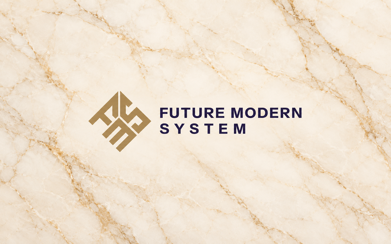
We shaped the identity around the angular FMS symbol, a palette of deep ink, cream and gold, and imagery rooted in marble. The cut edges and geometric details carry the same character across applications.
Turn the system into clear guidance
We brought logo usage, colour combinations, typography and visual-language rules into an interactive guide. Examples show how the elements belong together, with readable combinations and consistent spacing.
Make the identity useful every day
We built a hub that brings brand files and everyday tools together, including email signatures, stationery, stamps and social assets. The interface applies the same identity, with motion that follows the symbol and material-inspired visual language.
03 / WHAT WE DELIVERED
- Visual identity and logo system
- Ink, cream and gold colour system
- Interactive brand guidelines
- Brand-asset library
- Email signature, stationery and stamp tools
- Social-media assets and animated hub hero
What came together
A visual system and a working hub that help the team apply the same identity across everyday brand touchpoints.
Next project
View all ↗
Rafraf
We built Rafraf’s full e-commerce website, bringing a catalogue of 200K+ auto parts into a connected shopping experience, from finding a compatible part to checkout.