VORAX
A complete identity system, built to be used.
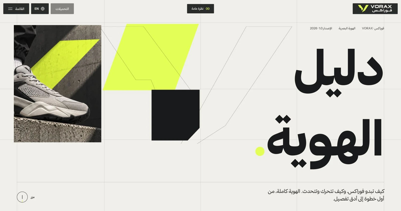
An Arabic and English brand guide that turns the VORAX identity into a working system: strategy, logo configurations, typography, colour, imagery, graphic language, tone of voice and downloadable assets.
- Industry
- Footwear & lifestyle
- Our role
- Eight-chapter bilingual brand guide
- Project focus
- Define the foundation
01 / THE CHALLENGE
A brand identity becomes useful when different people can apply it consistently. VORAX needed more than a logo board: the guide must explain the brand’s intent, show correct usage and provide the assets needed to carry the identity into everyday work.
02 / HOW WE DID IT
Define the foundation
Start with the brand promise and principles, then connect every visible decision to movement, precision and product presence.
Make the rules interactive
Build configurable logo, typography and colour tools that let users test the rules rather than only read them.
Prepare the handover
Pair usage guidance and application examples with downloadable formats suitable for design and digital production workflows.
03 / WHAT WE DELIVERED
- Eight-chapter bilingual brand guide
- Logo system and interactive logo lab
- Arabic and English typography tools
- Colour palette and contrast checker
- Photography, graphics and voice guidance
- Downloadable logo and colour packages
What came together
An identity guide that connects the reason behind the brand with the tools and files needed to apply it.
04 / INSIDE THE EXPERIENCE
Strategy before styling
The guide starts with “Make every step count” and a product-led footwear positioning. Movement, presence, precision, contrast, confidence and consistency provide the principles behind the visual decisions.
An interactive logo laboratory
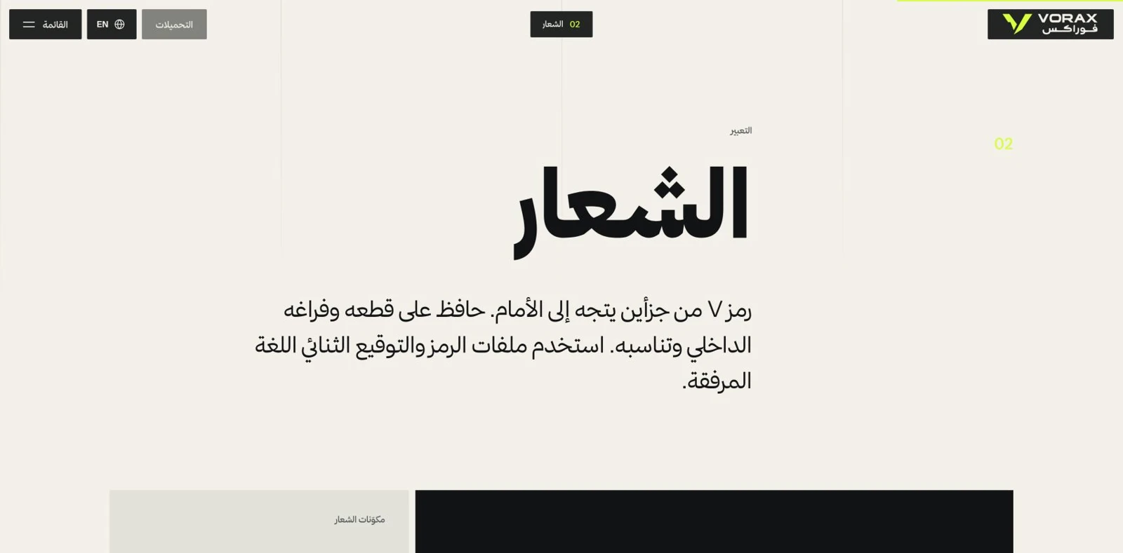
The two-part forward-facing V symbol works with Arabic and English wordmarks. The logo lab offers horizontal and vertical signatures, symbol, wordmark, badge and icon views, with background, colour, size, safe-area and grid controls.
Typography you can test
Thmanyah carries Arabic and Instrument Sans carries English, with italic English headlines expressing movement. Editable specimens, size and weight controls, a type scale and a bilingual glyph inspector make the type system tangible.
Colour with working rules
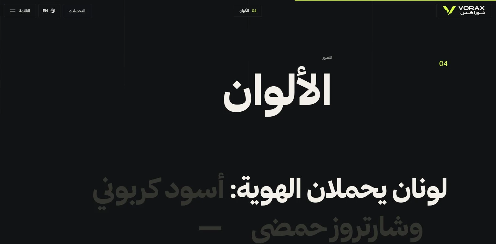
Carbon #111315, acid chartreuse #D7FF3F, warm porcelain #F2F0E9 and concrete #8A8D87 form the palette. The guide includes click-to-copy values, HEX/RGB/CMYK views, a 60/30/10 balance and a foreground/background contrast checker.
An identity in application
Product-first photography, architectural concrete, confident cropping and forward diagonal graphics extend the mark into a broader language. The image library presents campaign, editorial and packaging concepts alongside voice examples.
Downloads that finish the system
Logo variants are offered in SVG, PNG and PDF, with ZIP bundles. Colour resources include ASE swatches, CSS variables, JSON and an SVG palette, so the reference guide also acts as a practical asset library.
#111315#D7FF3F#F2F0E9#8A8D8705 / A CLOSER LOOK
Real screens from the project. Open any image to inspect it.
Explore the project in its own world.
Visit website vorax-branding.vercel.app ↗Next project
View all ↗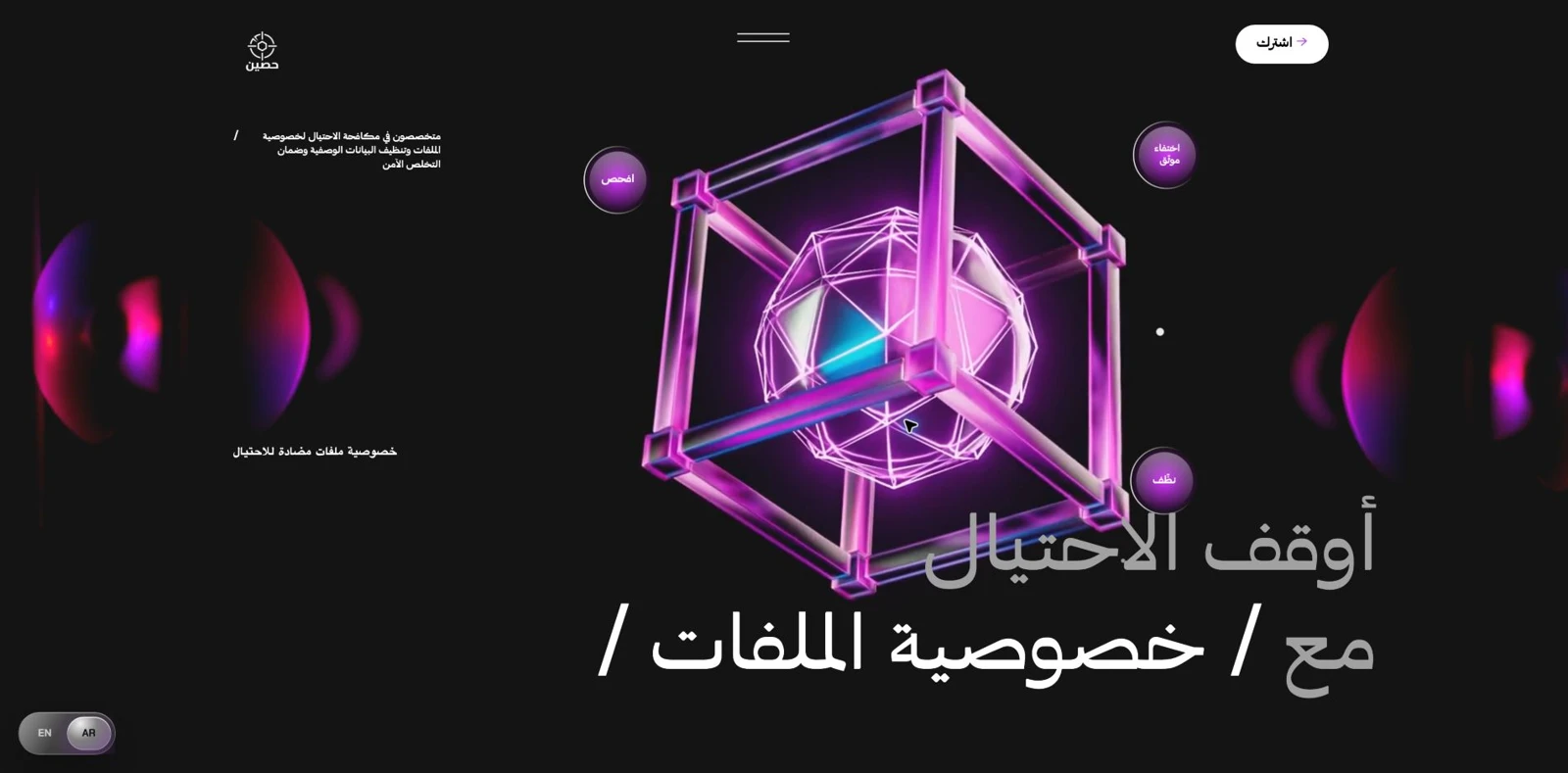
VanishGuard
A bilingual service website that explains file-risk review, metadata cleaning and safer disposal through a dark visual world, numbered service chapters, use cases and a structured enquiry form.